Phase 1: UX Research
Before creating our app, our team’s primary goal was to gather information about our topic and better understand our target users. We conducted research on our objectives, identified our target audience, and analyzed competitor brands to evaluate how they present themselves and engage with users. In addition, we conducted surveys to identify common patterns and challenges users experience with similar apps. As a team, we also conducted interviews to gain deeper insights into the in-person pet adoption journey and understand what users felt could improve their overall experience. Conducting this research provided us with clear UX insights that guided our app design and development.
Phase 2: UX User Persona
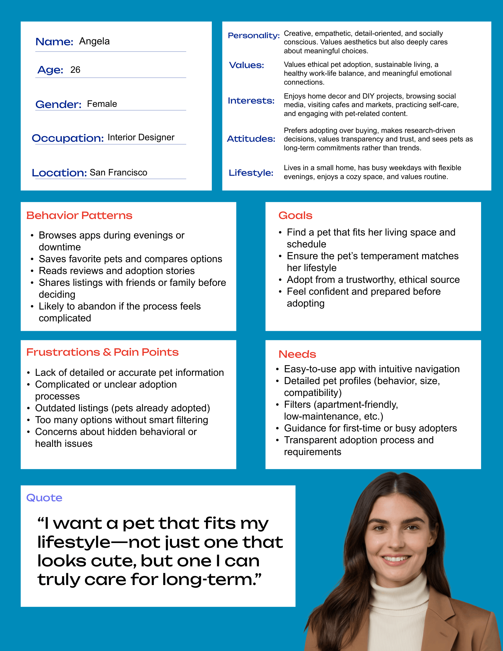
For phase two, our team created personas based on the research we had previously gathered. Each team member developed a persona that aligned with our user insights and findings. Based on my research, I identified a specific user type and used the data I collected to create a persona that accurately reflected their behaviors, needs, and motivations.
Phase 3: UX Content &
Architecture
In the next phase, we brainstormed the content for our app. We identified user goals, required content, functional needs, and additional “nice-to-have” features. Our next step was to create a sitemap because we wanted our content to be clearly organized, to establish hierarchy and relationships between pages, and to reflect how users naturally expect to navigate the app.
Phase 4: UI Content &
Architecture
For our final phase, our team gathered all of the information we had collected and moved into prototyping the app. We began by creating low-fidelity wireframes to outline the structure and core features users would interact with. After completing the low-fidelity wireframes, we moved on to developing high-fidelity designs. With our design concepts finalized, we created app mockups, using the sitemap from the previous phase to guide the user journey and navigation flow. Throughout the design process, we also developed a style guide that defined the typography, color palette, and overall visual identity we would use consistently across the app.
Tools Used