
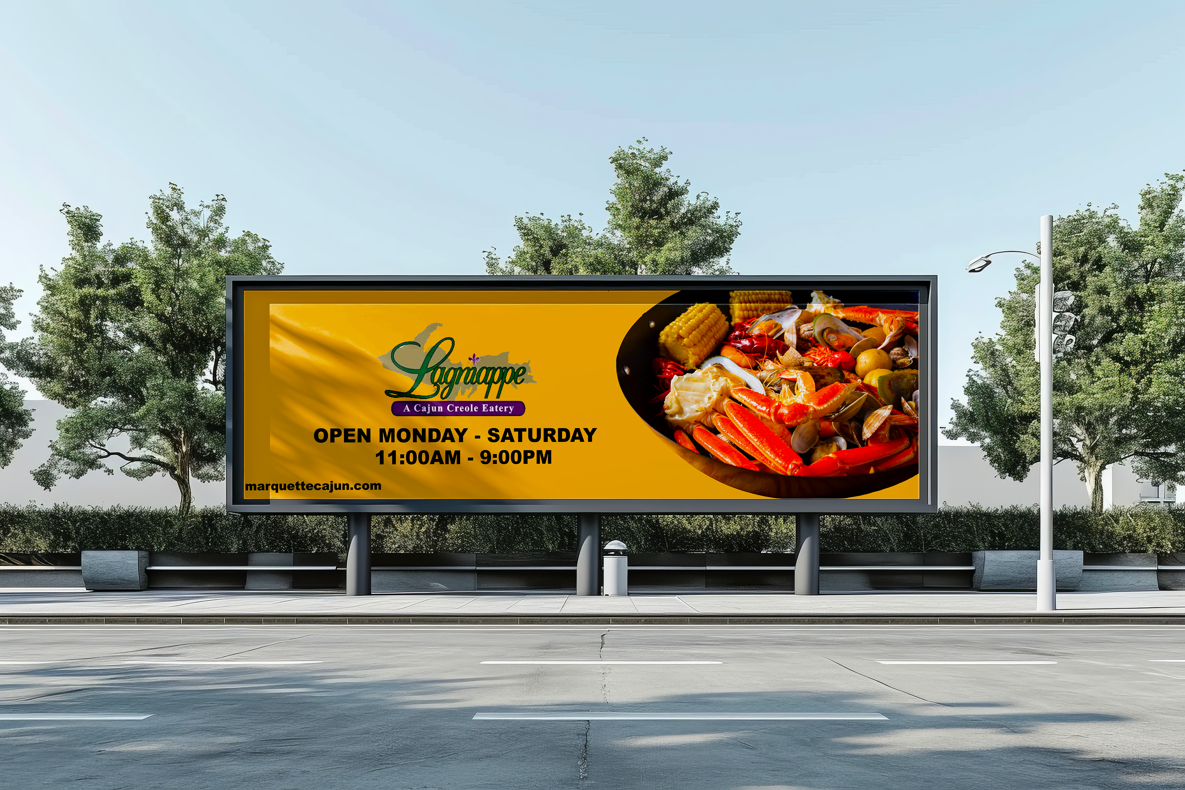
For this creative strategy project, I selected an ineffective billboard and redesigned it to improve clarity, visual impact, and overall communication. I analyzed what made the original billboard unsuccessful—such as cluttered layout, weak messaging, or lack of focus—and then built a new concept that delivered a stronger, more memorable message. The improved design uses simplified visuals, a clear call to action, and strategic use of space to ensure drivers can quickly understand the ad. The project demonstrates my ability to evaluate existing creative work, identify opportunities, and develop a more compelling solution.
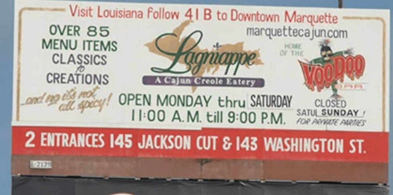
The thought process:
Advertising Appeals & Techniques
Rational appeal- a lot of facts about the event/company
I don't see any emotional appeal to this billboard, more than just directions and statements
No storytelling or techniques are given to this billboard
Creative Concepts & Ideation
Gather all the information into one and set everything apart from each other
Just put the most information on the billboard rather than the whole thing
Have a different approach, less text, and have the same font across
Copy & Visual Elements
There is no clear headline to this billboard. A lot of body copy, too much going on
Typography: different types of fonts
Slides
tools used